A few weeks ago Jina Anne hosted the fourth Clarity conference – A community conference about Design systems. This year I was very fortunate to have Mojang sponsor a trip to San Francisco for my first attendance.
Design systems is more than a trend at this point, and I was very excited to get to nerd out for a few days with other people who do the type of work that I do with Minecraft.
In the spirit of Jinjae Lee recently summarizing the Framer Loupe conference with 5 takeaways from Loupe, here's my three themes from Clarity 2019.
1. Shaping the collaboration
Before any design work happens, and before a design system is used as a medium for collaboration, there is that system in place that shapes how any design work happens.
The theme of designing this meta-system was revisited throughout the conference with a unique take on topic by almost every speaker.
Denise Jacobs kicked off the first day with a deeper look at how the you can generally organize collaboration for better, more creative outcomes. For me, this was a useful framing of the whole conference—While systems and rigid collaborative processess are set up to drive alignment and efficient work that span large organizations, ultimately what we all want is to enable each other, and have more fruitful collaboration.
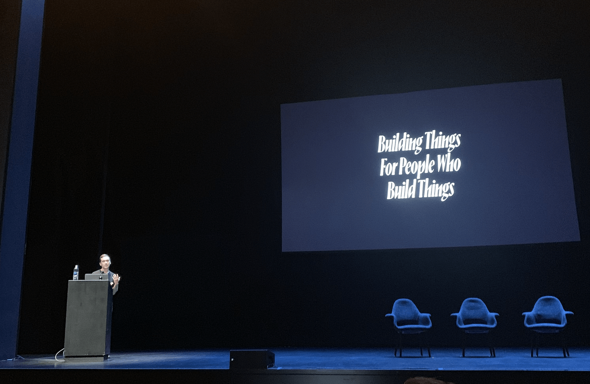
Daniel Eden summarized another aspect of it with the slide pictured, where he put extra emphasis on the people aspect.
Teresa Aguilera walked through quite a few methods for building a process and shared culture of design systems, based on how you'll involve consumers of the system in your organization.
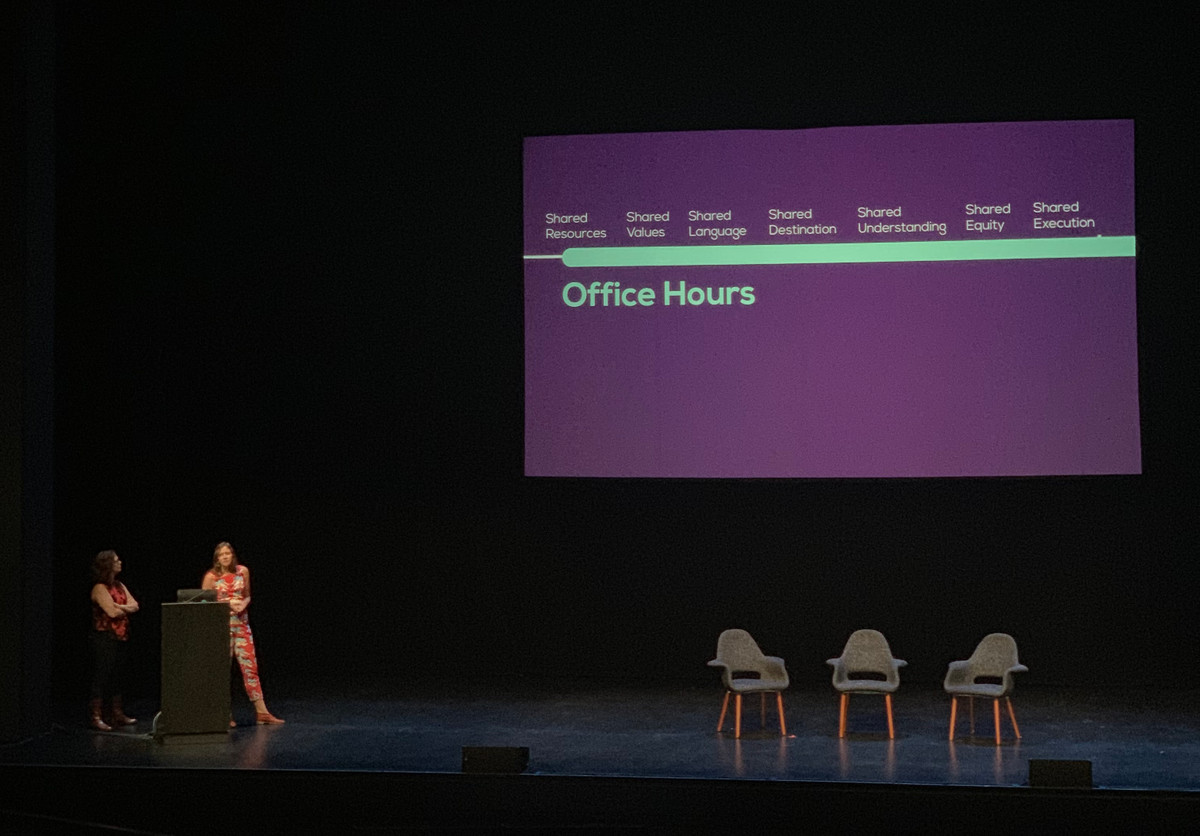
The methods ranged from the classic office hours, to Lean UX and embedding team members in external teams. The lenses of what you share with the partner team clarified where the actual benefits come from with the chosen form of collaboration.
In the visualization pictured above, office hours checks all the boxes.
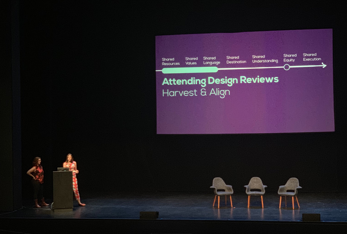
Also discussed was the value of attending the design reviews of the partner teams in your organization. Clearly this is a practise that doesn't scale, simply from the amount of meetings you will be involved in—But as a form of research it can be invaluable.
However, there is also a risk of it feeling like the design system police is present in the design reviews, mostly there to act as a roadblock for certain design work.
With this in mind, we should make the intention of research extra clear, that we are finding better ways to support the teams with the system. Every design systems team needs to build this shared understanding of values, resources and language—and it's a neutral thing to do.
On the topic of shaping collaboration, Rune Madsen and Martin Bravo from Design Systems International captivated the audience with well-picked quotes like the one below, which framed their presentation of case studies for clients.
Meta-design is much more difficult than design; it's easier to draw something than to explain how to draw it.
— Donald Knuth, The Metafont Book (1989)
And as if the Knuth quote wasn't enough, the Jack Burnham quote below summarised their thesis well, that systems needs a deeper encoding than the surface-level building blocks:
We are now in a transition from an object-oriented to a systems-oriented culture. Here change emanates, not from things, but from the way things are done.
— Jack Burnham, Systems Esthetics (1968)
2. Building systems tools
The fruitful relationships between design systems and software that supports it was another popular topic.
When Design Systems International described the case studies, they went into detail how they didn't just delivered design work, but applications and tools for the client to use on their own, to keep generating design according to the defined systems.
While dynamic brands and identities is nothing new, their approach to building tools for their clients was refreshing.
I missed out on capturing some of the neat examples on camera, but definitely check out the case studies on their website
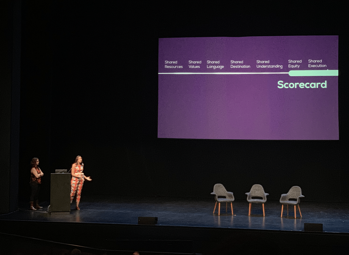
Scorecard-tools was one of the examples mentioned by Theresa Aguilera, for building shared equity and helping shared execution, through succintly presenting the status of different components in a system.
Scorecards is simply a table-presentation of the status of a design systems, that visualizes the state of the different components, and make the expectations of the system more clear.
Visualizations like this is more transparent to stakeholders (shared equity) and shares understanding of quality, need for improvement etc (shared execution).
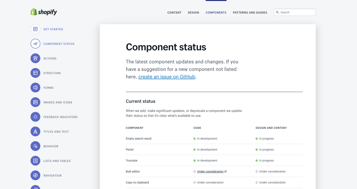
The Polaris Component Status (pictured above) is a good publicly-avaliable example of a scorecard in use.
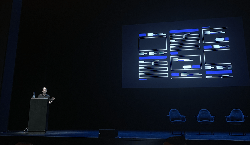
Daniel Eden gestured toward our future of system's collaboration, in his talk Where We Can Go (here's the online version).
Daniel emphasised the anthropological aspect of system's work at a company the size of Facebook, and the need for unifed work across disciplines.
In the above photo a systems-tool at Facebook was discussed, that was used for visualizing all the individual outcomes of tweaking a system component—A tool that goes hand-in-hand with another quote presented by the Design Systems International team:
Designers love to craft principles, rules for their coworkers to follow — this rarely works. The principles always create more work.
There is little motivation for someone to change their own behaviour simply because someone with no authority posts a sign.
Smart designers study how coworkers tools/processes make it hard to do good design – and they make better ones
— Scott Berkun, Author
To me this balance is one of the more interesting nuances of design systems work.
Scott's note about authority not being enough definitely resonates – But is the answer only to provide helpful tools and process, or can principles and guidelines work if they simply are well motivated and agreed upon?
This balance of helpful sharing and more authoritative guiding is very hard to get right, and really depends on the type of collaboration and organizational situation.
In my work I've definitely encountered the full spectrum, with both new designers asking for the set of principles and guidelines to adhere to, and more stronger pushback and Not Invented Here in other cases.
A final point from Daniel that resonated is how we should always talk about systems as though they were real and fully functional. This is needed to not obfuscate the system vision with practical matters and minutae.
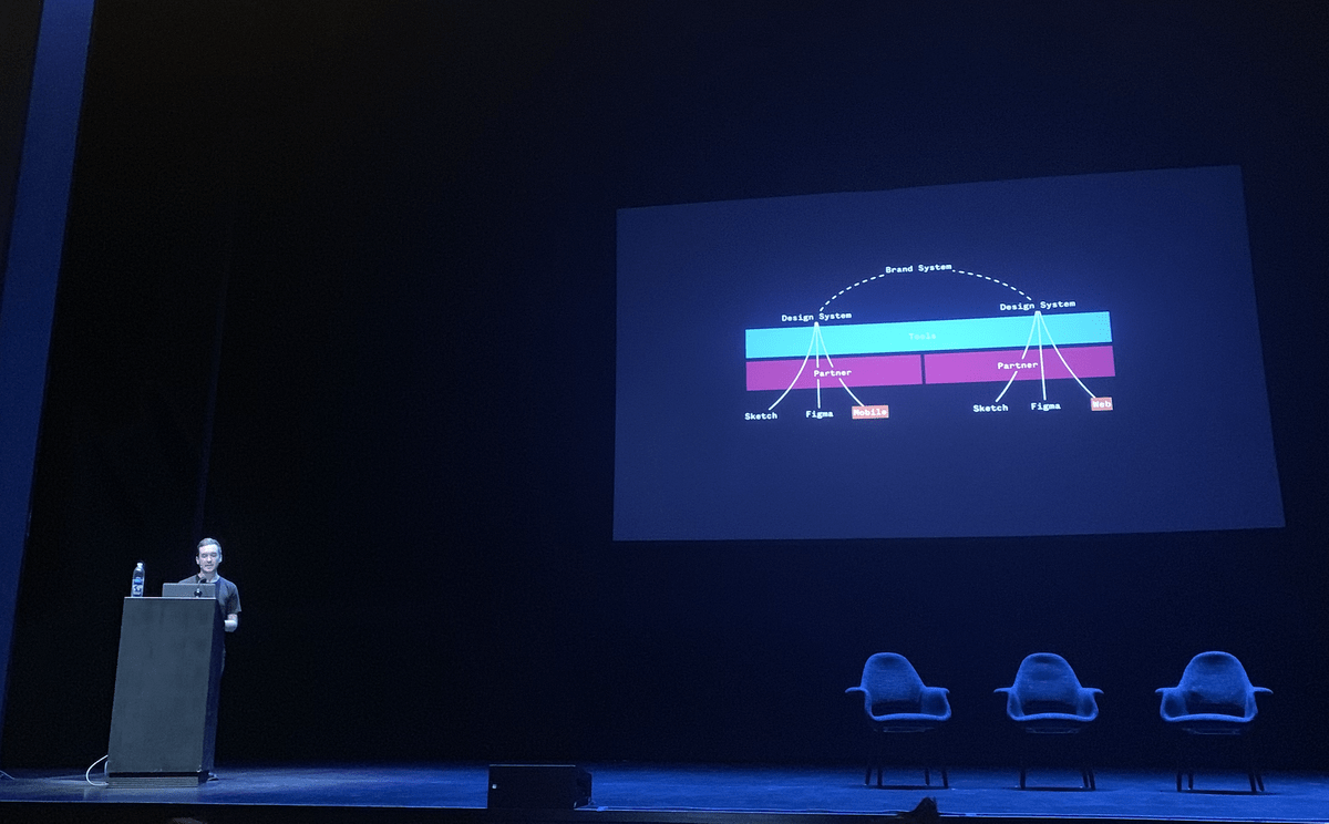
Working within a system is often more a state of mind than a strictly implemented process—And it's more about people and relationships than (always imperfect) tools and artifacts.
A system is always evolving, and never finished, so there is no point short-selling it. Whatever you have right now is a system.
3. Humane, holistic systems
On one hand, components are a way to bake assumptions into our work, embedding barriers at a systemic level. On the other, they’re an opportunity to embed accessibility best practices into our workflows and tools up front.
— Marcy Sutton, Garbage Pail Components
The above quote, paraphrased from Marcy Sutton's talk Garbage Pail Components, gets to the heart of another problem that many speakers approached, which is how we need to do more to encode what's ethical and equitable for everyone, in our systems.
Marcy also presented a rich set of examples that showed how seemingly small "accessibility bugs" fundamentally ruined the usability of the system for certain groups of users.
Related is that Marcy also has done some really interesting work in showing how apps with more complex client-side framworks can be made accessible. One example is this extensively researched blog post, talking about the accessibility of different routing solutions.
Ethan Marcotte, Design Systems Lead at Vox Media, later followed with a captivating narrative that went into depth on the big-picture societal implications of questions like these.
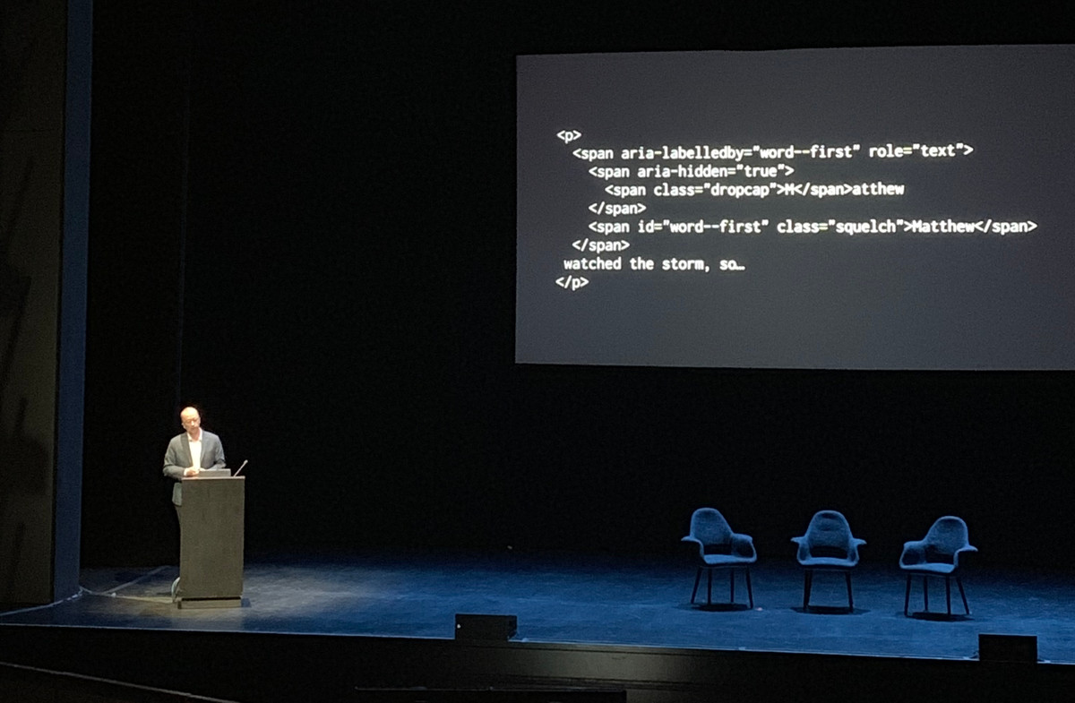
To start off, Ethan described a simple enough example from his work — Making a drop caps typesetting accessible to users with screen readers.
The rest of his talk kept zooming out from these basic examples of system problems, and added historical context for how new technology promised freedom, but eventually became institutionalized and instead ended up disenfranchising the people.
On the second day, Tatiana Mac continued exploring the topic on many levels, which included extending on the terminology of Atomic Design. Our atoms and organisms shape products, that shape our industry and society—It starts with the values of our team, continues with seemingly tiny design decisions in our systems, but ultimately shapes much more.
For more reading on these topics, Ethan pointed us to the book The Real World of Technology, written by the scientist and humanitarian Ursula Franklin.
Mina Markham described several example from her work, on making products not only internationally viable, but fully localized through custom graphic design, layout and data.
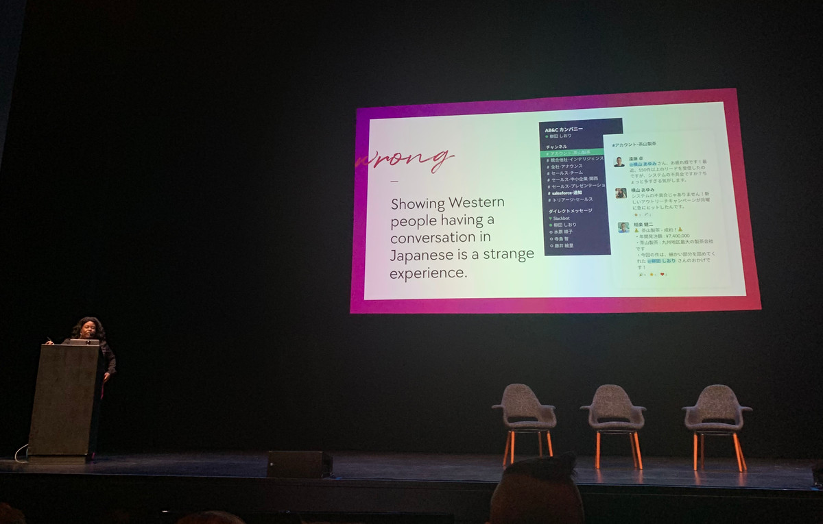
What I found especially interesting was the localized content design, with examples of how Slack localized language and avatars in the screenshots that demonstrated the product on their marketing site.
Finally, Daniel Eden also touched on the topic, suggesting how systems and tools can not only ensure accessibility and localization, but also privacy, through ensuring that products based on the system protects the rights and data of customers.
In summary
From a few of the discussions with more seasoned attendees, and from watching a few of the talks from previous years, it seems pretty clear to me how the focus of Clarity have changed over the years.
While there are tactical, nuts-and-bolts aspects of design systems work, many of those practises have already been established, and there's lots of good resources avaliable. Whether you are organizing design assets, working with CSS, React or a color system, there's examples from teams that went to great depth on the topic that we can point to.
Where we are now, is with systems deeply engrained in the working processes of big design and engineering organizations, and with complex dependencies and relationships with many teams and stakeholders. Systems is not a tool among others, or a project you knock out — it's often the way we work, and how we shape the design culture of our organizations.
This was celebrated, but also problematized, in how that culture (or perhaps, monoculture) isn't enough to make sure we aren't systematically excluding a certain type of end result, whether it's encoded in the way we do design, the design system, or in the technology and frameworks we build.
Thanks to Jina for organizing Clarity, and to the speakers for sharing their stories 🖤
If you are more curious, keep eye on the Clarity website for upcoming recordings of the talks, and more information about future events.